Teaching Typography in Photoshop: Start with Exploration, Grow into Design
Sep 14, 2025
When I first started teaching Photography, I didn't think much about teaching typography. At the time, we only had access to CS6 (and no, it wasn't actually THAT long ago, we just weren't up to date on industry technology). I fought hard to get the district to approve getting Adobe CC so we could be on a level playing field and I finally got it (after COVID).
But it was during a Video class that I was teaching, where I was having students create their titles and their end credits that I started thinking "hmm... maybe I should be teaching them about typography."
I only had students for a semester, so it didn't seem that important and I brushed it off again.
When I started teaching my yearlong classes, I started diving in deeper into typography - pairing fonts with advertisements and products. I started having students analyze why a certain font was chosen over another. I laughed at how often my students told me they actually liked comic sans or papyrus! *barf*
I realized that typography was something that both my students and I were taking for granted in the classroom. I sweat over the font choices in the graphic design world, but in photo? Never really thought about it - until I had to design wedding save the dates or grad / baby announcements. Like my students, when it came to photography, fonts were just an annoying menu to scroll through and pick one that “looks good.”
But the more I thought about it and reflected on my own creative process, the more I realized this wasn't just an annoyance, it's a need - especially as I started having students take the adobe certification test.
Typography is the voice of design, the way meaning is carried visually, and a huge part of preparing students for professional creative work. So now I teach very specifically about typography, color theory, and branding in all of my creative classes!

And We Start With The Basics:
Type Tool Exploration
In this lesson, students learn by doing. Instead of memorizing definitions, they click, drag, change fonts, adjust kerning, stretch leading, and play with effects. They get a hands-on understanding of how Point Type and Paragraph (Area) Type behave differently, how color and spacing affect readability, and how effects like drop shadows can help (or hurt) legibility.
By the end of this activity, students aren’t just typing words on a canvas and picking random fonts, they’re seeing how small design decisions completely change how text feels. It sets the stage for everything else we do in Photoshop with type.
Here are some of the prompts I have my students do to explore:
- Type your first name in 72pt Arial Bold.
- Change the text color to blue.
- Type the word “Design” and change the font to Times New Roman - Italic.
- Create Point Type (click once) and Paragraph Type (click and drag). Write one word in each to compare.
- Type the word “Creativity” and adjust the kerning between the “C” and “r”.
- Add a line of text and increase the tracking so the letters spread across the canvas.
- Add two lines of text and adjust the leading so the lines are close together, then farther apart.
- Apply All Caps to one word.
- Apply Small Caps to another word.
- Warp a word using Arc style (under Warp Text).
- Try a different warp (Wave, Flag, Fisheye). Which one is hardest to read?
- Create a circle with a shape
- Type “Hello” along the circle path using Type on a Path Tool.
Want the entire resource including the screenshots of the tools in Photoshop?
👉 You can grab the FREE Photoshop Type Tool Exploration Lesson now! [Click here]

Typography in Context: Portraits and Products
Now that your students understand how to use the type tool, it's time to give them an opportunity to play with font pairing. After this lesson, they'll be introduced to the anatomy of typography where they can dive deeper into how typography is designed and it's purposes, but for now - we get them familiar with different font families and how serif and sans serif pair well together and have their own personalities.
-
Portraits & Typography Personalities Lesson: Students pair fonts with character portraits, creating a name and tagline that reflect the personality of the person. It’s all about making type match mood and personality.
-
Products& Typography Personalities Lesson: Students take the same idea and apply it to branding and advertising. They create a name and tagline for a product, choosing fonts that speak directly to the target market. It’s a natural bridge into marketing and advertising design.
👉 Try the Portraits & Typography Personalities Lesson [Click here]
👉 Try the Products & Typography Personalities Lesson [Click here]

Next Step: Anatomy of Typography
Once students know how to manipulate type, choose fonts, and try to pair them together - the next question is what are they actually looking at? That’s where the Anatomy of Typography Lesson comes in.
This project gives students the chance to label the “body parts” of letters (spines, spurs, ears, bowls, counters, etc) and better understand more about serif typography especially. This is a necessary step in preparing students for the Adobe Certification Test as it provides them with industry vocabulary they need around baseline, x-height, cap height, ascenders and descenders.
With this project, they can work from supplied examples or create their own phrase from scratch, making their own labeled anatomy poster in Photoshop.
Because of the interactive nature of this activity, students are bound to enjoy this WAY more than if you just handed them a worksheet and told them to label it on paper.
Also, for those of you who are also teaching illustrator or procreate, you could have some fun and have your students also create illustrations of the phrases!
👉 Explore the Anatomy of Typography Lesson [here]

Finally: Visual Hierarchy with Typography
When students are ready to apply what they’ve learned, they have an opportunity to put it all together and create a poster that guides the viewer's eye with elements and principles of design - focusing mainly on color blocks, shapes, and typography!
This is one of my favorite lessons because I get to "read their mind" by using visual hierarchy techniques to guide their eyes through a design in a way that is predictable. I wrote a blog post all about this project which you can check out here.
Why This Sequence Works
This sequence builds confidence step by step:
-
Exploration: Students experiment with the Type Tool and discover what it can do.
-
Application: Students apply type knowledge in design contexts with people and products.
- Anatomy: Students learn the vocabulary and visual structure of type.
-
Application: Students apply type knowledge to their growing understanding of visual hierarchy to "control your mind" - or really, just your eyes.
By the time you’ve moved through all five lessons, your students will not only know how to use type in Photoshop, but also how to think like designers - matching fonts to audiences, moods, and markets while strategically guiding your eye through the design.
If you want students to see fonts as more than “just letters,” this set of Photoshop typography lessons will do the trick. Start with exploration, then move into portraits, products, anatomy and then visual hierarchy and watch your classroom designs go from average to intentional.
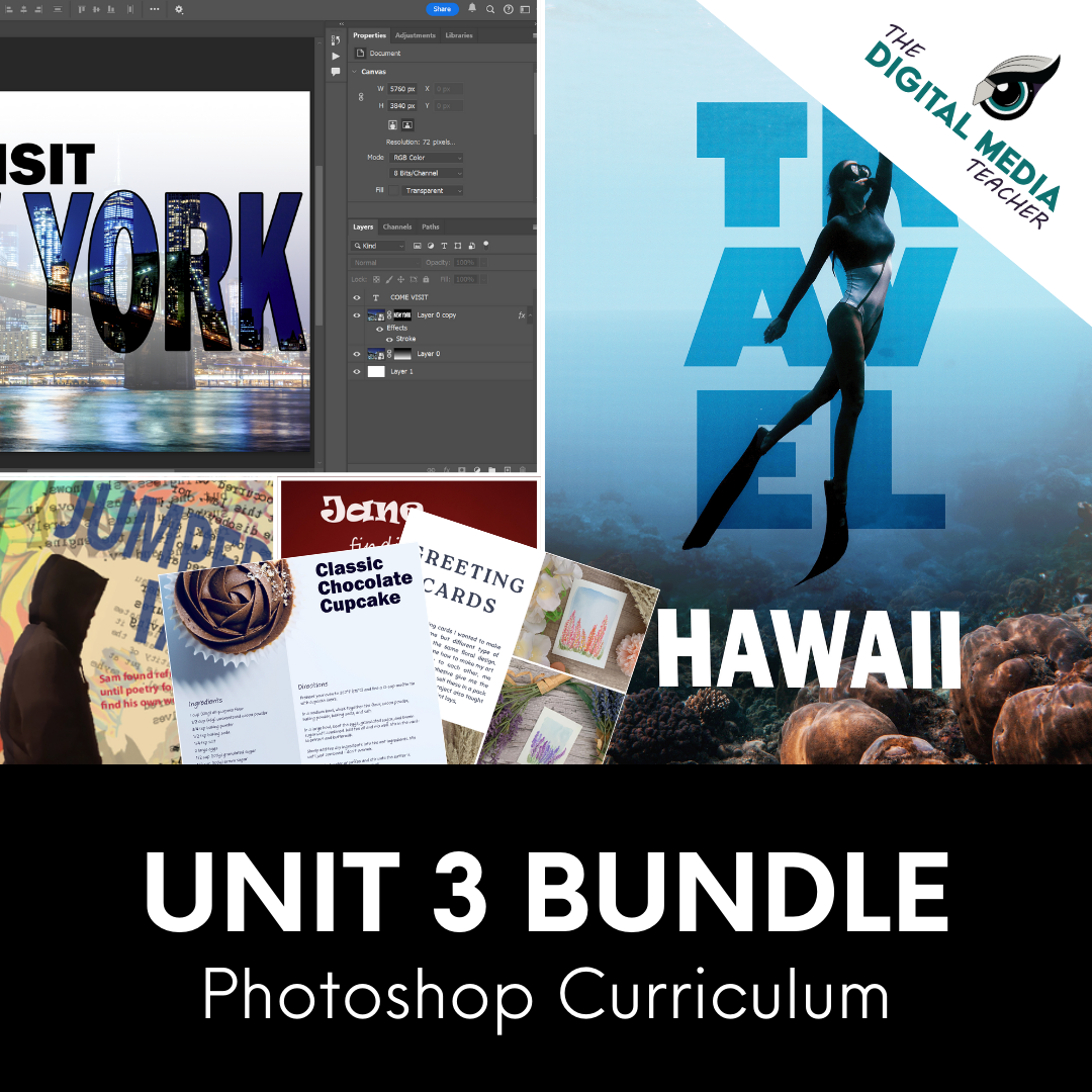
👉 These lessons are part of my Full Photoshop Curriculum, Unit 3. Check out this growing bundle! Click Here for Unit 3 and Click Here for the Full Photoshop Curriculum.