The Power of Visual Hierarchy with Typography
Aug 31, 2025

Have you ever looked at a poster or package design and thought, “Wow, I have no idea where to look first"?
That is a classic case of weak visual hierarchy.
On the other hand, when your eyes land immediately on a bold headline or striking phrase, and then naturally flow to supporting details, you are experiencing hierarchy done right.
The best part is that you do not need flashy photography or complicated illustrations to make it happen. All you really need is typography, color, alignment, and simple shapes. With these, designers can completely control the way a viewer experiences a design.
Think about it:
-
A headline in all caps and high-contrast color screams “Read me first.”
-
A line of smaller text tucked into the corner whispers “Notice me later.”
-
A well-placed arrow or block of color can act like a tour guide for your eyes.
Now, fancy visuals or graphics can help catch your eye. Just look at this example of Ritz Crackers and their package design that lines up perfectly on the shelfs to create a seamless feeling. Simple, mostly color blocks and text, but powerful design.
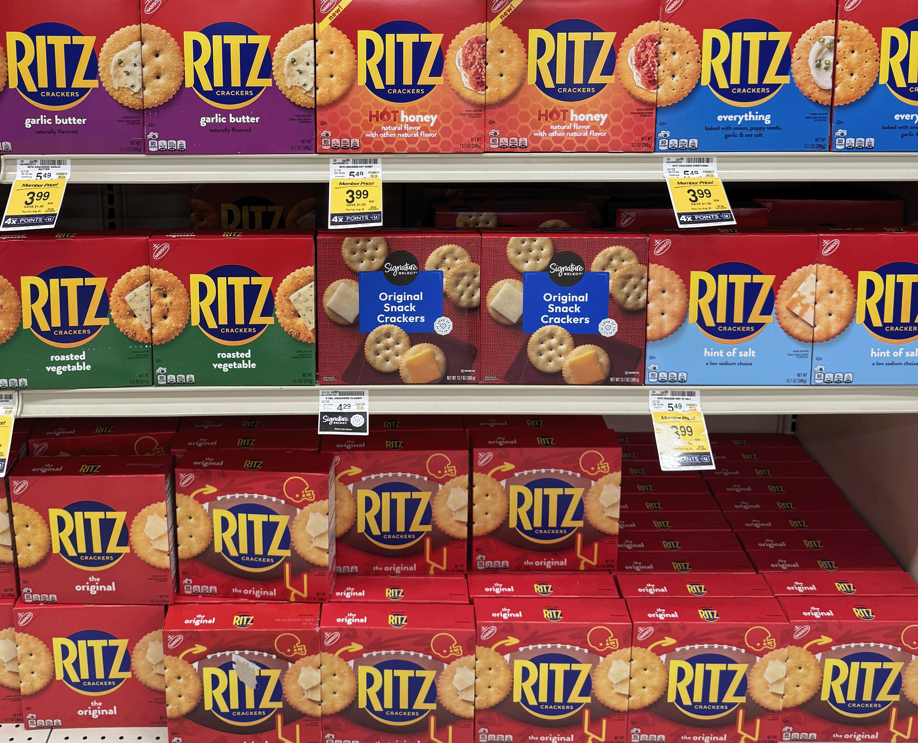
In this example, you can also clearly see the hierarchy of package design is stronger on the Ritz brand crackers than on the Signature Select brand crackers, which show more cracker, but are harder to see from a distance with the smaller font size and smaller cracker. The intention is clear, but the branding and the visual hierarchy is lacking.
The Classroom Project
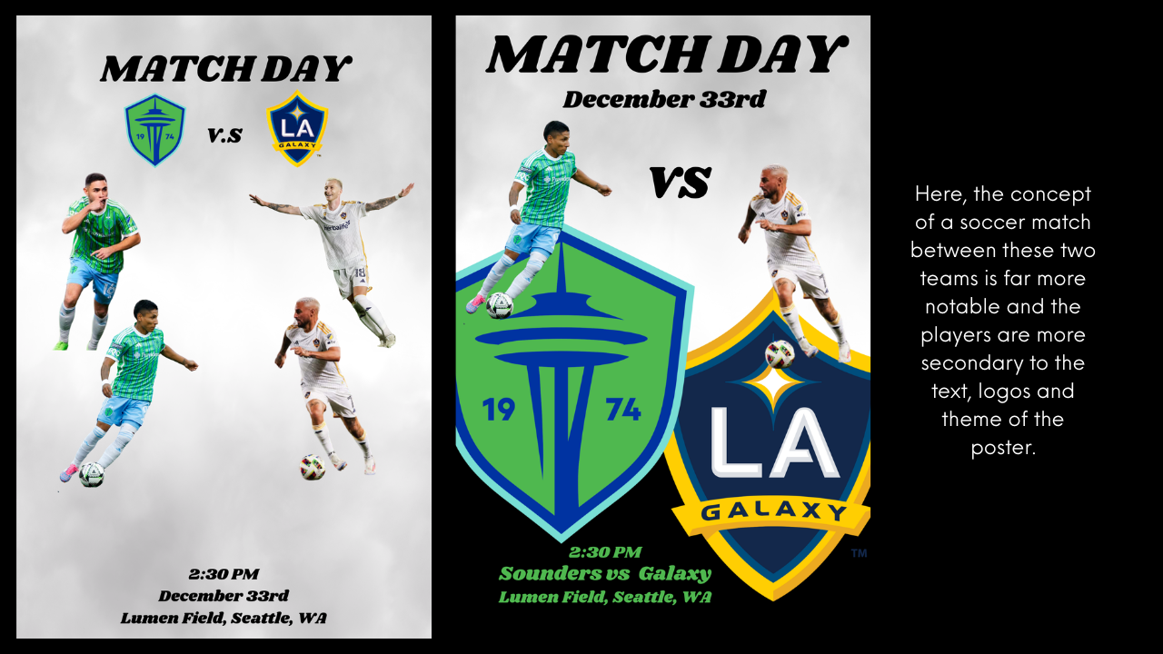
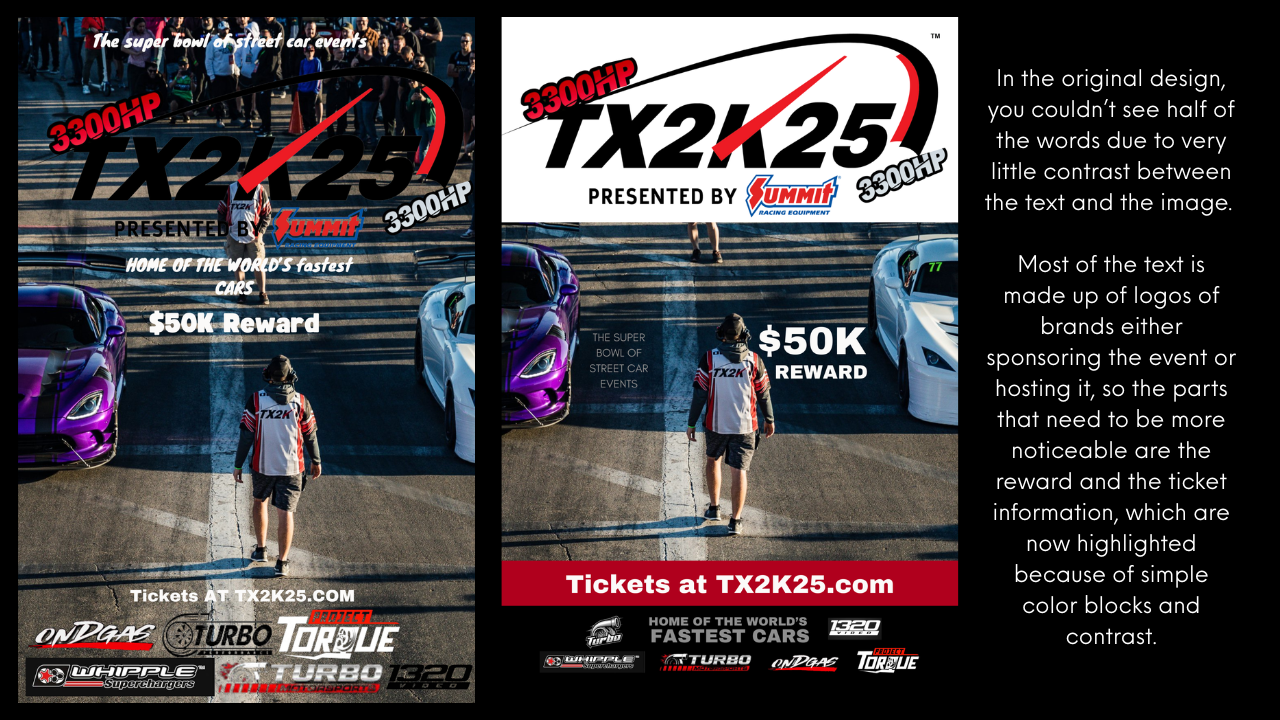
In the Photoshop Typography Poster Project: The Power of Visual Hierarchy, students put these ideas into action. They choose a single phrase, plan how they want the viewer’s eye to travel across the page, and then build a poster in Photoshop using only type, simple shapes, and color. No photos. No clipart. Just pure design decisions with strategy in mind.
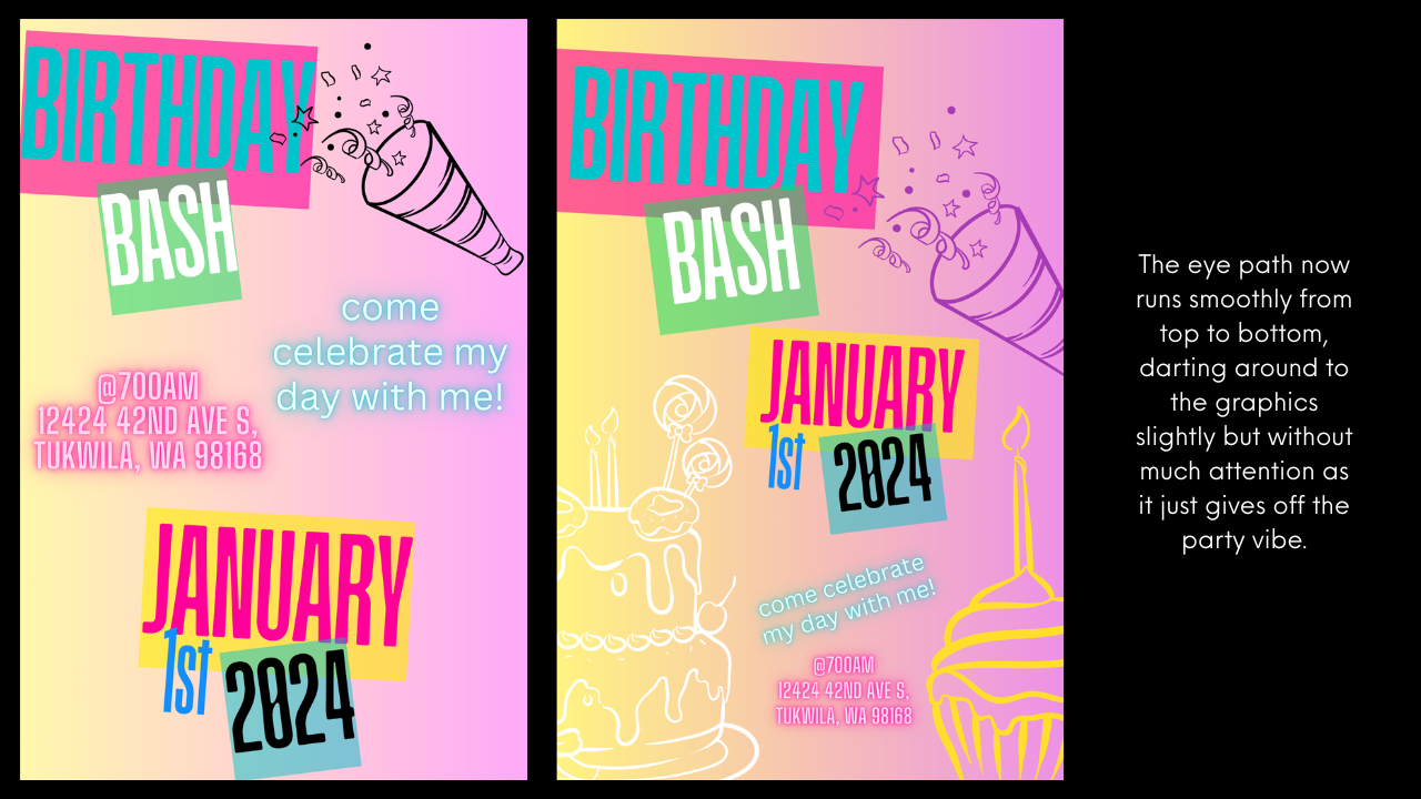
I start off by reading their minds with posters I designed that tell them where they will look in a design and why. With each new poster, I reveal something different - "you looked here first, but you didn't read it." "You read this first" (in another spot on the page) and subtle changes in color that start making them think about specific brands or target markets.
Once the student posters are created, the real test begins. Either digitally or printed, students swap with classmates and see if their predicted eye path matches reality. If three classmates all start at a spot the designer did not intend, or flow through the design erratically, it is back to the digital drawing board!
You can find an app or website that can track your eye through a design, but I prefer printing the designs and having students use a pen to show their eye path physically. It helps both the viewer and the designer to understand how each individual person might view their design differently and why.
It is through peer feedback and revision, that students learn how subtle changes in typography and alignment can completely change their design.
Good Design vs. Not-So-Good Design
Here is where you can have some fun. When introducing the project, share examples that highlight the difference between good hierarchy and bad hierarchy. Find examples around your own school or neighborhood for best analytical results:
-
A Strong Hierarchy Example: A poster where the bold headline jumps off the page, secondary text sits neatly aligned, and a bright color block carries the eye to the tagline.
-
Weak Hierarchy Example: A poster where every line of text is the same size, the colors clash, and the viewer’s eyes are darting around with no clear direction.
Here's some examples of a fun visual hierarchy challenge my students did last year where I asked them to design a poster but "Make Me Uncomfortable" using Canva where the students were supposed to create a badly designed poster first and then a better design second. (I learned that my students thought good design was BORING - so the redesigned version is what I did by combining both of their versions live in class to make a stronger design).
Why It Matters
This lesson proves to students that typography is not just about picking fonts or using the right words. It is about strategy.
It is about guiding the viewer's attention, shaping perception, and even influencing decisions.
When they understand visual hierarchy, they understand one of the most powerful tools in design. And the bonus? Once a student sees it, they cannot unsee it. They will start noticing hierarchy (or the lack of it) everywhere from cereal boxes to movie posters (and they may come back and blame you for it later, like my students often do).
I recently saw a comedian who was picking on comic sans. His stand up was accurate, but it was very funny and a great clip to show in my classroom. (Check it out here: https://www.youtube.com/watch?v=XrR9TCRDm6U)
Why I Do This Project in My Classroom
Every time I run this project, I watch students go from “I dunno, I just picked a font cuz I liked it” to “I made this word bold because I want people to read it first,” and "I chose this font because I think it will appeal to my target market, which is..."
The lightbulb moment that happens when they test their posters on classmates and realize whether their design choices worked or not is one of my favorite moments. This lesson is one of the best lessons for introducing the concept that design is not random. Every choice matters, and those choices can shape the way people see and experience a message.

Want to Try This Lesson?
If you would like to bring this project into your own classroom, the complete Photoshop Typography Poster Project: The Power of Visual Hierarchy is available in my Teachers Pay Teachers shop. It includes the full lesson plan, student worksheets, reflection activities, and rubric-aligned assessments so you can run it with confidence. This lesson is also a part of my Full Photoshop Curriculum and my Unit 3 Bundle on Design Principles with Photoshop. But keep in mind, this lesson can be a standalone in your classroom and can easily be adapted to work in Canva, Google Slides or even done on paper if needed.