Logo Design: Understanding Logomarks, Wordmarks, Submarks, and More
Apr 25, 2025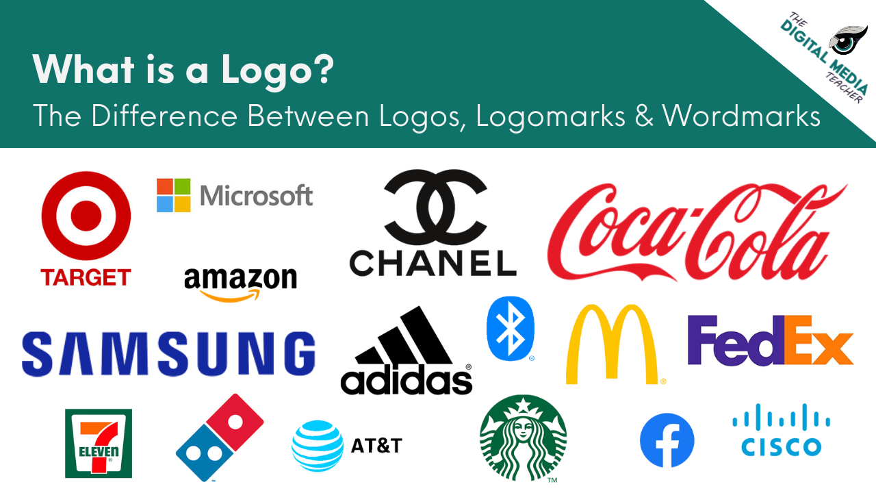
Logomarks, Logotypes, Wordmarks, Combination Marks, Submarks, and Favicons...WHAT?
When students first start learning about branding and logo design, it is easy for them to think that a logo is just a picture with some text. But professional logo design is about much more than that.
When introducing students to logo design, it is important to help them realize that a logo is not just one static graphic. Professional branding requires creating flexible, adaptable systems that work across different sizes, platforms, and uses. Understanding the different parts of a logo system (like logomarks, logotypes, wordmarks, submarks, and favicons) gives students a strong foundation to design logos that feel intentional and functional.
Before we dive into the different types, let’s start at the beginning: What exactly is a logo?
What is a Logo?
A logo is the visual symbol of a brand’s identity. It is a combination of typography, imagery, color, and design that together create a unique and recognizable mark for a company, product, organization, or personal brand.
A good logo is not just attractive. It serves a purpose:
-
It communicates who the brand is
-
It helps build recognition and trust
-
It distinguishes the brand from competitors
-
It adapts across different media, sizes, and uses
However, a logo is not the entire brand. A brand is much bigger than its logo. It includes the company’s values, mission, voice, products, customer experience, and emotional connection with its audience.
The logo is simply the symbol that represents all of those elements visually.
Teaching students this distinction early helps them design with more intention. Instead of asking, "Does this look cool?" they start asking, "Does this logo feel like the brand? Does it reflect what the company stands for?"
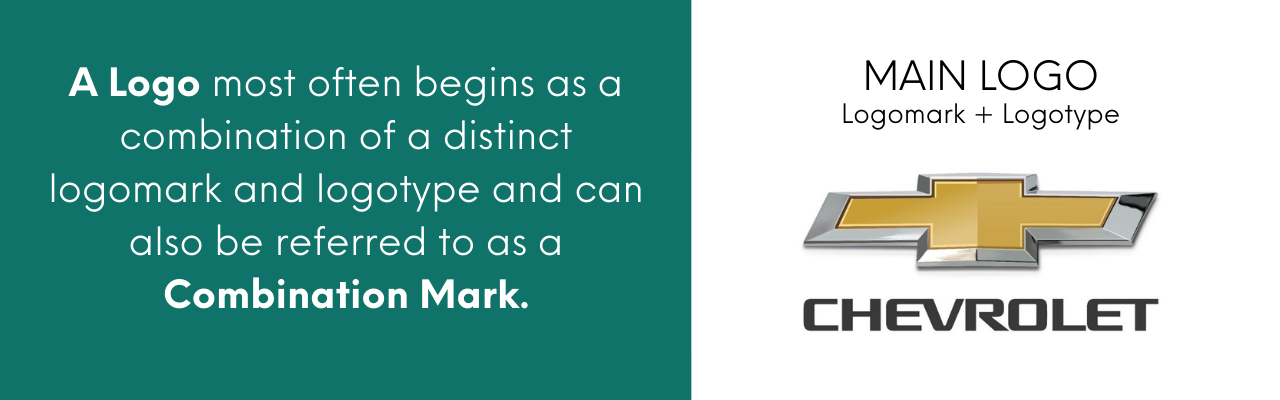
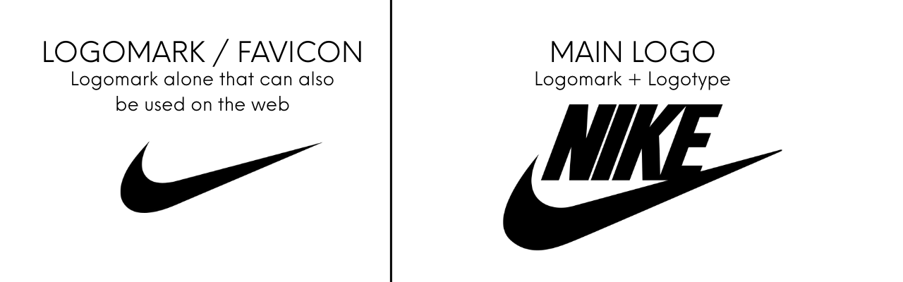
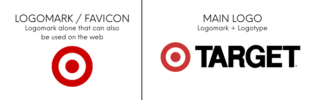
What is a Combination Mark?
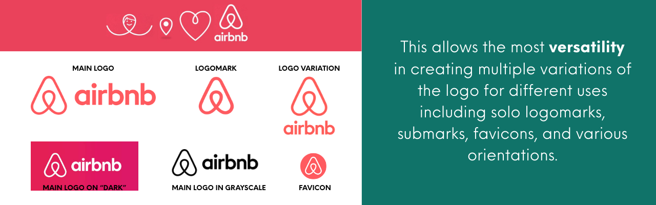
A combination mark is a logo that includes both a logomark (symbol) and a logotype (text), designed to work together as one unit. Combination marks are flexible because the text and symbol can sometimes be used separately depending on the branding need.
Combination marks are very common in professional branding because they provide the most versatility for marketing and communication.
Examples:
-
Spotify’s soundwave icon plus text
-
Adidas' three-stripe symbol with their name
-
Lacoste’s crocodile and brand name
Why it matters:
Teaching students to design combination marks helps them build full identity systems. They learn to think about how a logo must flex across different uses while keeping the brand recognizable.
What is a Logomark?
A logomark is the visual symbol or graphic part of a logo without any text. It might be a shape, icon, or abstract design that represents the brand in a recognizable way, even when no words are attached.
Logomarks are often used where space is limited or where the brand is already well known, such as on app icons, social media profiles, or small merchandise.
Why it matters:
Teaching students to create strong logomarks helps them communicate visually without relying on text, and builds their ability to simplify complex ideas into clear, powerful images.
What is a Logotype?
A logotype refers specifically to the text portion of a logo — the stylized brand name. It focuses on font choice, customization, and arrangement to convey the brand’s voice and tone. In many logos, the logotype appears alongside a symbol (logomark), but it can also stand alone if needed.
Why it matters:
Understanding logotypes teaches students that typography is not just functional, it is expressive. Every typeface, curve, and letterform adjustment plays a role in shaping a brand's personality.
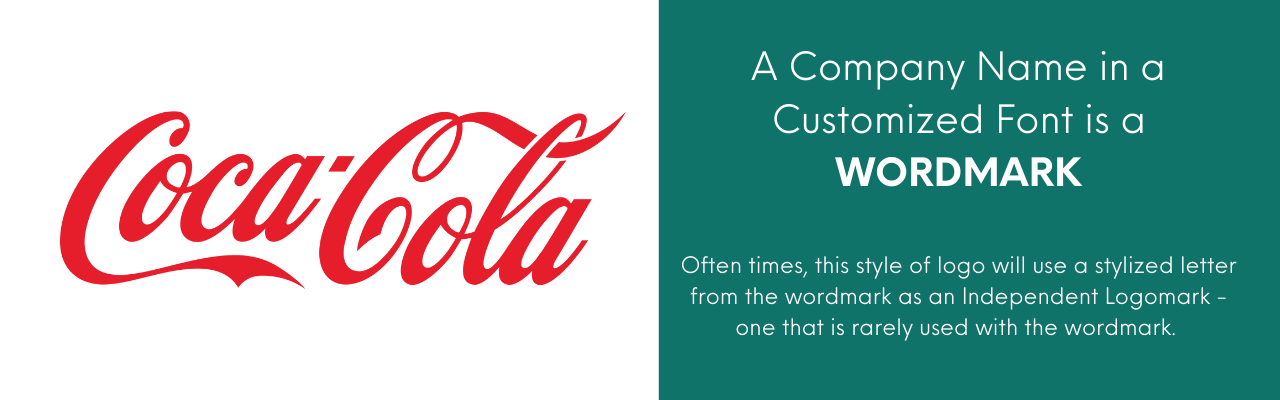
What is a Wordmark?
A wordmark is a complete logo made entirely of stylized text, without a separate symbol or graphic element. Sometimes designers embed subtle visuals into the typography itself, but the letters are the main identity.
Wordmarks are often used when a company’s name is distinctive and strong enough to carry the brand on its own.
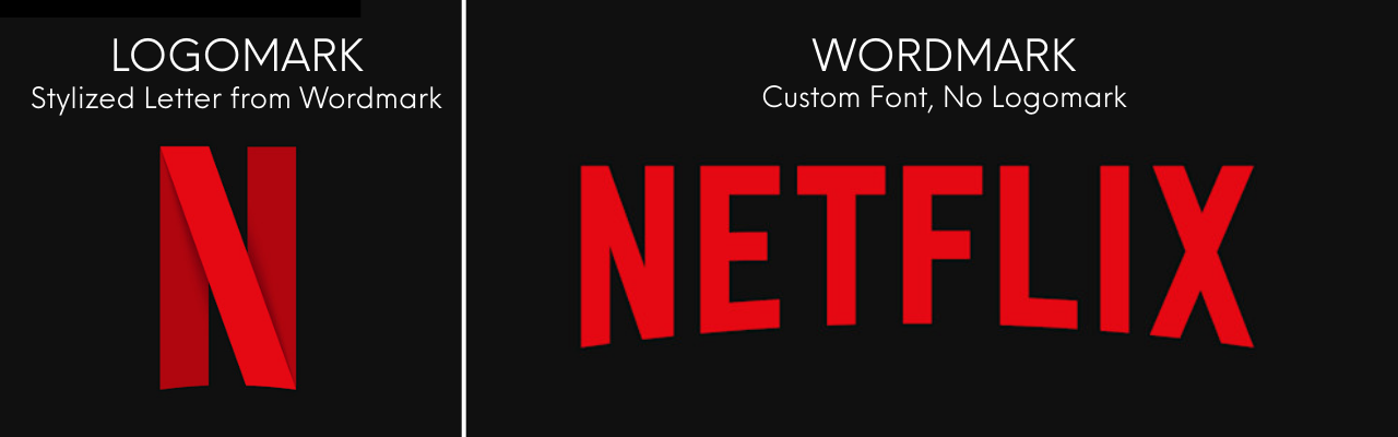
Why it matters:
Wordmarks push students to rely on strong typography, spacing, and subtle customization to create memorable designs. They learn that a great logo does not always need a separate image to be effective.
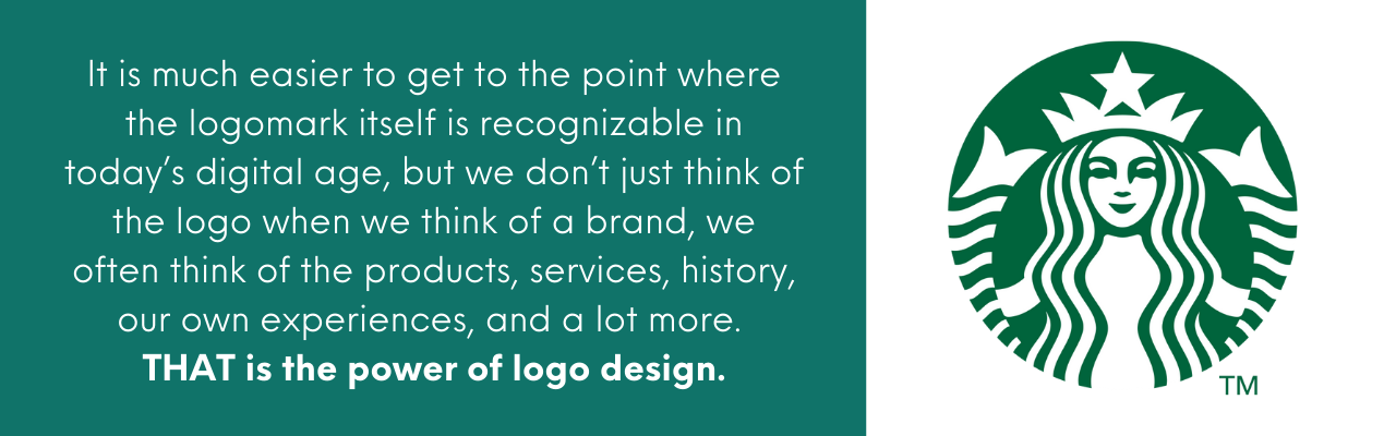
What is a Submark?
A submark is a simplified, alternate version of the main logo. Submarks are usually created for use in spaces where the full logo would be too large, too detailed, or awkward. They often feature initials, monograms, or badge-style designs that maintain brand identity at a smaller scale.
Examples:
-
Instagram's camera icon in a circle
-
Starbucks’ round badge with the mermaid
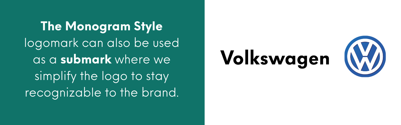
Why it matters:
Submarks show students how to adapt logos for real-world branding needs. They help reinforce that a good brand identity must work not just in one format, but across many contexts.
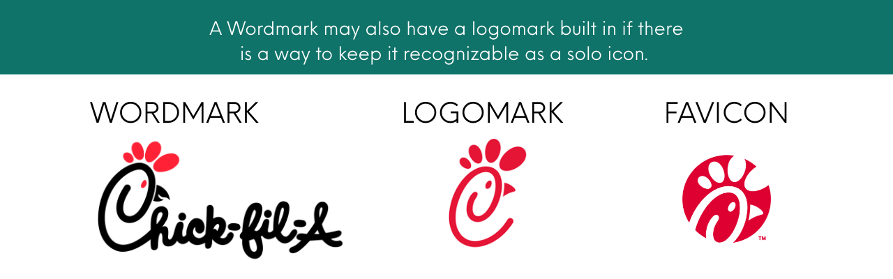
What is a Favicon?
A favicon is the tiny icon that appears next to a website’s title in the browser tab. It is a highly simplified version of the brand - often a single initial, a graphic detail from the logo, or a minimized version of the logomark.
Favicons are tiny, usually around 16x16 or 32x32 pixels, which means that clarity and simplicity are critical.
Examples:
-
Facebook’s “f”
-
Amazon’s lowercase “a”
-
YouTube’s red play button
Why it matters:
Designing a favicon teaches students about scale, clarity, and digital application. It reinforces the idea that strong branding must hold up at both large and tiny sizes.
Why Teaching These Logo Types Matters
When students understand the differences between logomarks, logotypes, wordmarks, combination marks, submarks, and favicons, they start thinking like real designers. They realize that a logo is not just one file, but a complete visual system built to communicate a brand’s story across every platform and experience.
In my classroom, I always start by teaching combination marks first. Combination marks help students learn how to balance symbols and text, how to create flexible brand systems, and how to build designs that can adapt for different uses. By working with both a logomark and logotype from the beginning, students get a much better grasp of visual hierarchy, branding flexibility, and real-world design thinking. Once students are comfortable designing combination marks, we move into creating standalone wordmarks, where typography has to carry the full weight of the brand identity.
This progression not only strengthens their design skills, it also prevents common beginner mistakes, like overly literal or inflexible logos. By breaking down these logo types and building systems intentionally, students improve their design process, create stronger final products, and prepare themselves for real-world expectations in the creative industry.
Instead of making logos that just "look cool" for a project, they learn to build brand identities that can grow and adapt - exactly the kind of thinking that sets them apart as young designers.

Ready to Teach the Full Logo Design Process?
If you are ready to move beyond surface-level logo projects and help your students design with purpose, I have created a complete set of classroom tools to guide the process:
- Design Process Poster
- Beginner to Advanced Logo Design Creative Briefs
- Morph Matrix Lesson & Activity
- Font Pairing Activity
- Editable Logo Design Pitch Deck Canva Template
- Editable Brand Identity Quick Sheet Canva Template
These resources are designed to help students think more critically, explore ideas more deeply, and create more interesting, intentional logo designs. By building strong pre-production habits and practicing real-world branding skills, students move beyond obvious ideas and learn how to design logos that truly represent a brand.
Grab the Logo Design Bundle here and start building confident, intentional student designers!